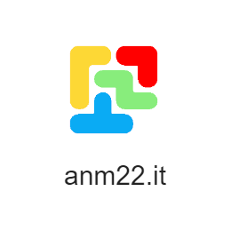
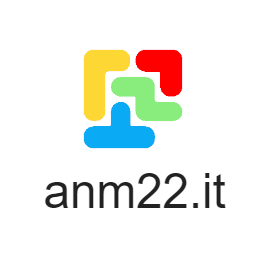
The ANM22 logo has identified the company’s products from the very beginning. These guidelines demonstrate how to use the logo and how to pair it with the text 'ANM22' or 'anm22.it'.

The logo alone is not always sufficient to help those unfamiliar with the company understand how to get in touch, especially on printed materials where interactive links cannot be used. For this reason, the company domain can be placed alongside the logo.
The text may be positioned either to the right of the logo or below it, as explained in the following sections.
The design with text on the right is used when the logo is viewed up close (such as in a website header, within a paragraph, etc.).

The design with text below the logo is used when the brand is placed within a square area (such as backdrops, partner logo lists, etc.).
Depending on the print size and the viewing distance, you can choose to use text that is wider or smaller relative to the logo. The text should NOT match the exact width of the logo.
There is no specific font, but the following font family is generally used on the web:
font-family: Roboto, Arial, sans-serif;
Similar fonts may also be used, but they must not be italic or have any unusual character distortions.
The domain must always be written in lowercase letters, whereas 'ANM22' should always be in uppercase.
The logo can be used in color or in black and white (see dedicated vector file). For the text, the following color shades are used:  #222222,
  #ffffff.
For printing purposes, #222222 can be replaced with  #000000.
 Click here to download the ANM22 logo in vector format.